When writing a cover letter, it’s easy to overlook small details that actually make a big difference. Spacing is one of those details—if done right, it helps a cover letter look clean, professional, and easy to read.

The right cover letter spacing can help your application stand out and make a positive first impression on hiring managers. Understanding the basics of spacing is a simple way to boost your chances of getting noticed and to ensure your message is clear.
1) Use single spacing within paragraphs for a clean look.
Using single spacing inside each paragraph gives a cover letter a neat and modern style. It ensures that the text is not too crowded or too spread out. Hiring managers find this layout easier to read and more professional.
Single spacing also keeps the content on one page, which is important for most job applications. Double spacing can make the letter look too long and less organized. According to formatting best practices and advice from career experts, cover letters that use single spacing look polished and clear for readers. For more details, see this guide on cover letter spacing.
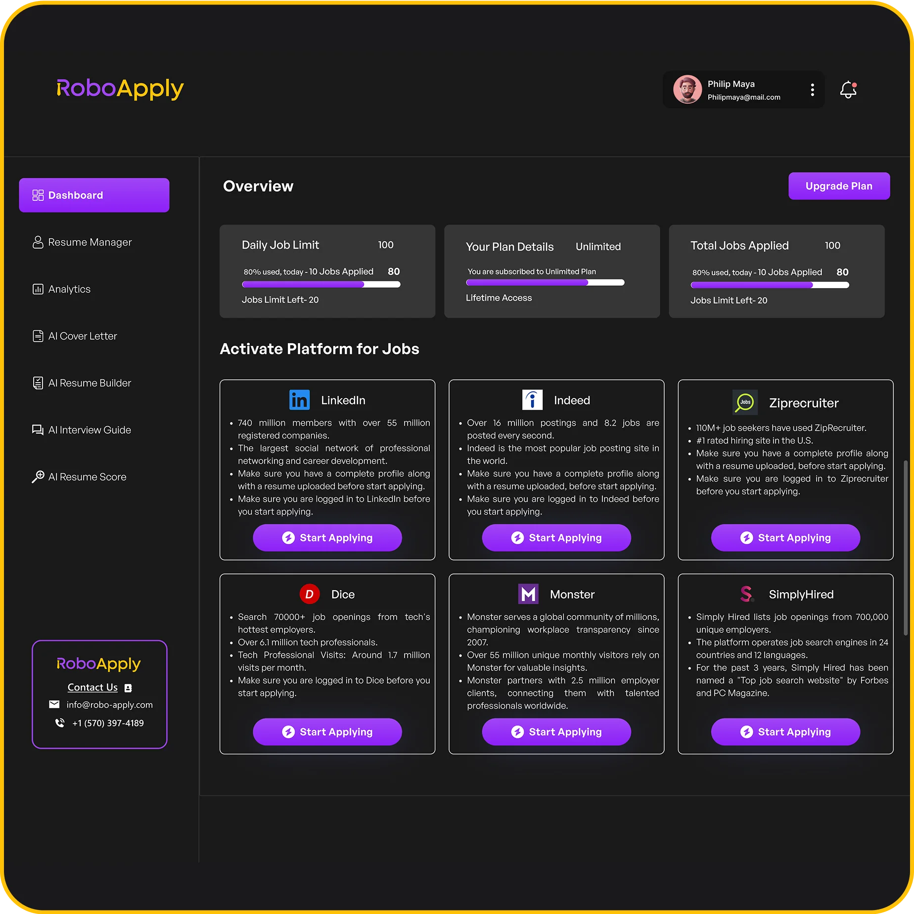
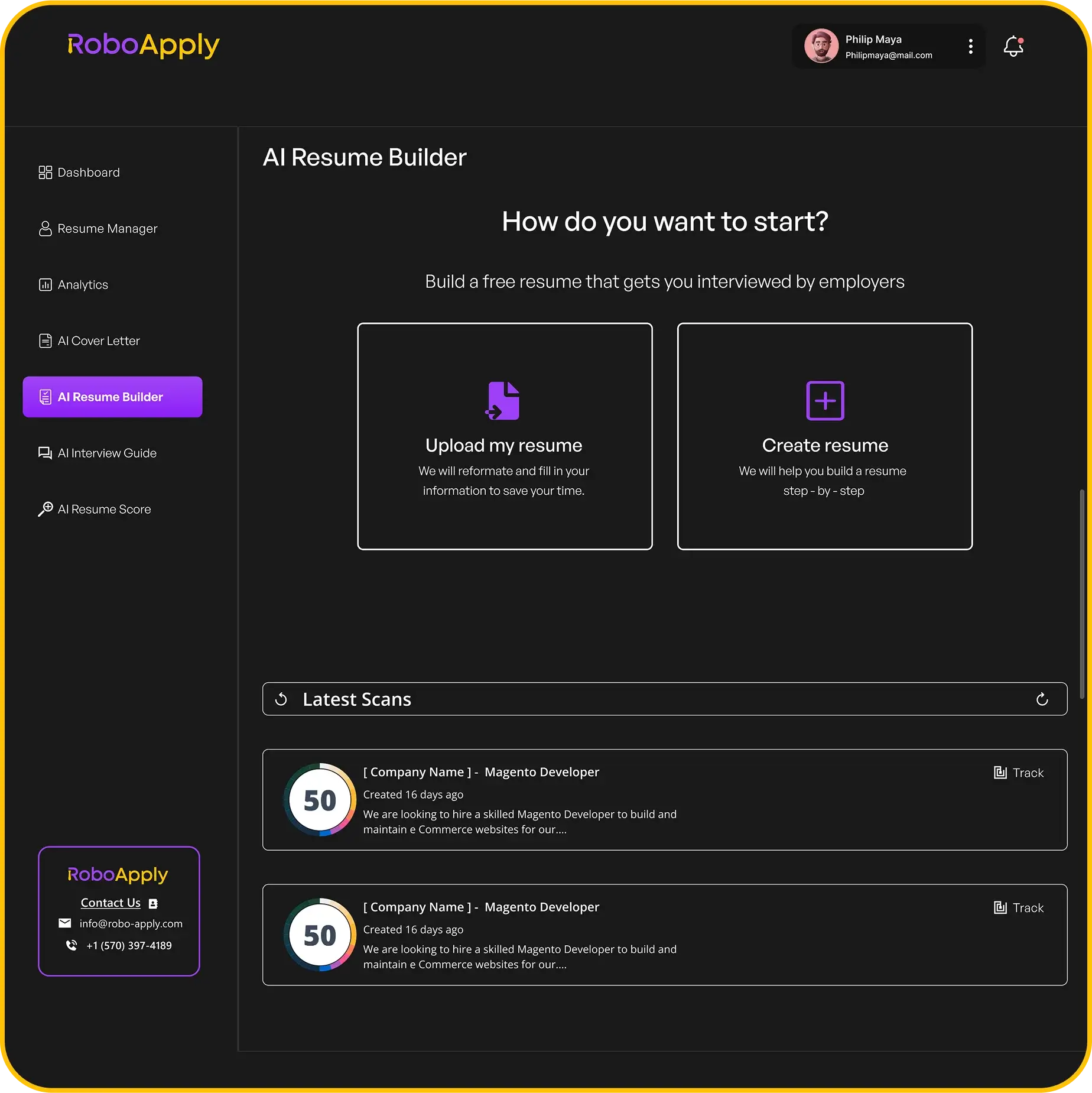
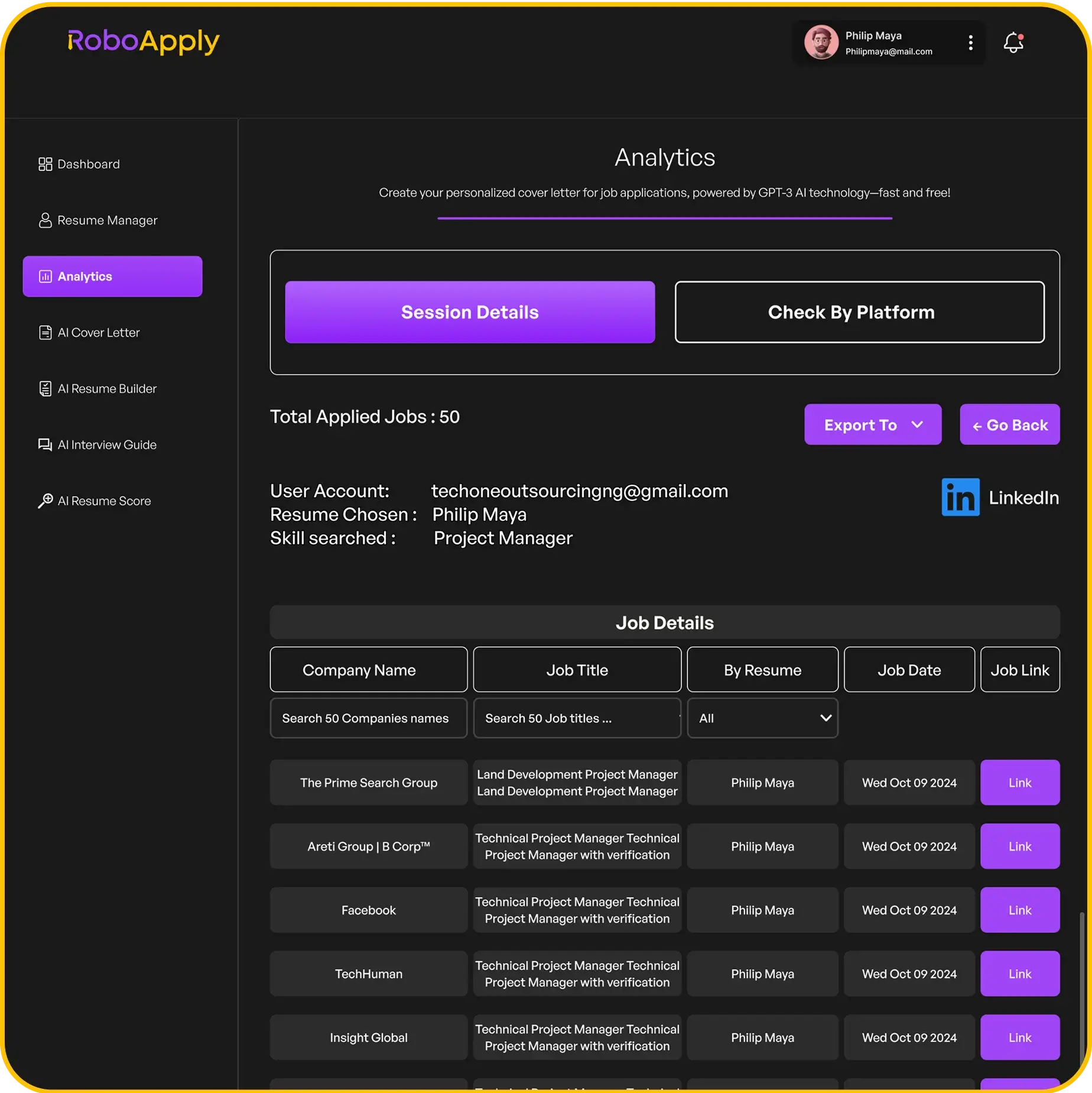
Job seekers who use RoboApply’s AI cover letter builder can easily apply single spacing by default with one click. If they need to make changes, editing with RoboApply is simple and fast.
To apply single spacing, select all the text in your document and set the line spacing to “Single.” Make sure there is still a blank line between each paragraph.
This approach, endorsed by hiring professionals, keeps the cover letter looking sharp and easy to scan for important details. Using the right spacing will help make your application more effective.
2) Add a space between each paragraph for readability.
Adding a blank line between each paragraph in a cover letter makes it much easier to read. This simple step helps each paragraph stand out, so hiring managers can quickly scan the document without confusion or eye strain. Most style guides recommend this as a best practice for business letters.
When formatting a cover letter, use single line spacing within each paragraph, then press “Enter” once to leave a full blank line between paragraphs. This keeps your letter looking neat and professional. It also makes the document easier to read, especially when viewed on a computer or mobile device.
Professional formatting tools like RoboApply’s AI cover letter builder automatically add appropriate spacing between paragraphs. This is helpful if you want to save time and avoid formatting mistakes. For those formatting manually in Word or Google Docs, just remember to hit “Enter” between each section and use a basic, readable font.
Recruiters look for cover letters that are organized and legible. Leaving a space between each paragraph shows good attention to detail and improves the reader’s experience. For more formatting advice, see guidelines on cover letter spacing from professional resume writers.
3) Leave extra space after the greeting for better format.
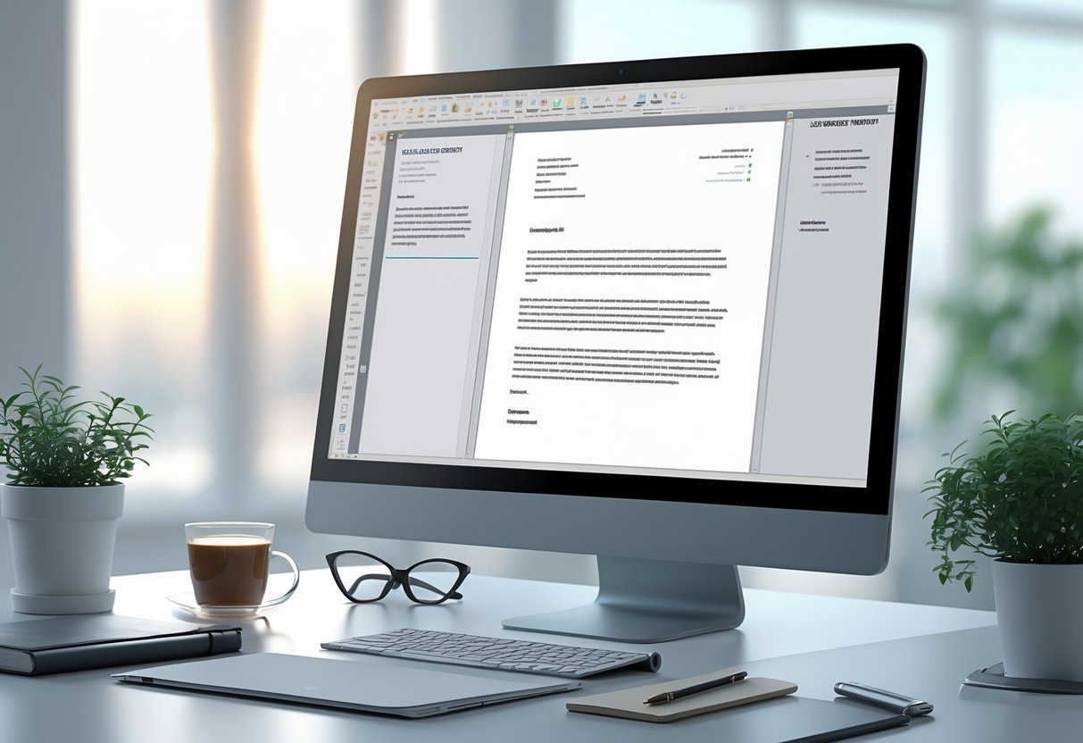
Leaving an extra space after the greeting in a cover letter makes the document easier to read and more professional. This space separates the salutation (like “Dear Ms. Smith,”) from the main body of the letter. It helps the content stand out and gives the reader a visual break between sections. This approach is recommended in most professional guidelines, such as those found in cover letter spacing guides and academic resources.
To format properly, writers should insert one blank line after the greeting before starting the first paragraph. This keeps everything neat and organized. Using a tool like RoboApply makes it easy, since it automatically adds the right spacing to every cover letter.
Here is a quick example showing the correct spacing:
Dear Ms. Smith,
I am writing to apply for the Sales Associate position at Landmark Retail. I have over three years of experience in customer service, and I am eager to bring my skills to your team.
My background has taught me the importance of communication and reliability. I am confident that I will add value to Landmark Retail and support your goals.
Thank you for your time and consideration.
Sincerely,
Jordan Lee
Maintaining this spacing style will help make the letter clear and easy for hiring managers to follow. RoboApply’s AI cover letter builder takes care of these formatting details automatically, saving time and reducing mistakes.
4) Include three line spaces before the closing phrase.

Adding three line spaces before the closing phrase in a cover letter helps create a neat and professional look. This spacing gives enough room for a handwritten or digital signature if needed. It also makes sure the closing, like “Sincerely,” stands out and is easy to find.
To do this, the applicant simply presses the “Enter” or “Return” key three times after finishing the final body paragraph. This places the closing phrase at a comfortable distance from the main text and keeps the letter visually balanced. Many professional guidelines, including those from Purdue OWL, recommend this approach.
RoboApply’s AI cover letter builder automatically adds the correct space before your closing, making the formatting process fast and reliable for any user. For those building their letter manually, adding three blank lines is a simple and clear step.
Here is how the spacing should look in a real cover letter:
Thank you for considering my application. I look forward to the opportunity to discuss how my skills and experience can contribute to your team.

(press "Enter" three times)


Sincerely,

Jamie Reynolds
With this easy spacing guideline, users make sure their cover letters look polished and meet professional standards.
5) Maintain 1-inch margins on all sides consistently.
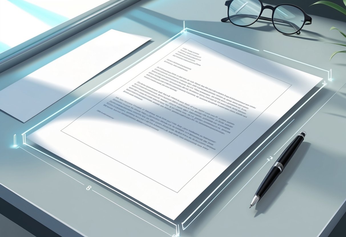
Keeping 1-inch margins on every side of a cover letter is a simple way to make it look clean and professional. This spacing helps the text appear balanced and ensures the letter is not crowded or hard to read. It also meets common standards that hiring managers expect from job application documents.
Using standard margins also makes it easier to print and scan cover letters without cutting off important information. Most word processors set margins to 1 inch by default, so users just need to check settings before saving or printing. This tip works for physical and digital applications.
For those using RoboApply’s AI resume and cover letter builder, maintaining 1-inch margins is automatic, saving time and reducing formatting mistakes. This helps job seekers focus more on their content and less on technical details.
More details about why 1-inch margins matter can be found in advice from major career sites like Indeed’s cover letter formatting guide and Purdue OWL’s cover letter tips. These guides confirm that using standard margins makes your letter easier to read and helps you look organized to employers.
6) Use black ink on neutral-colored paper if printed.
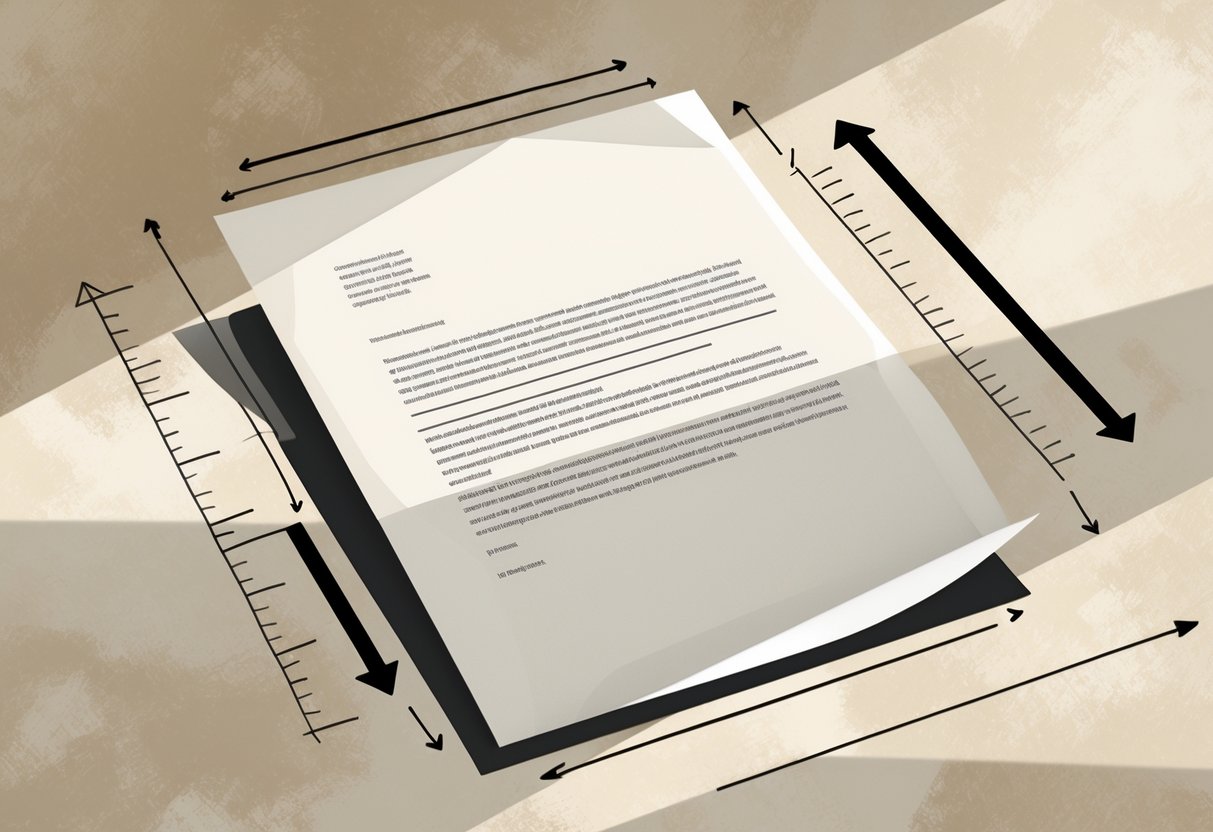
When printing a cover letter, always use black ink on neutral-colored paper like white, ivory, or light gray. This looks professional and is easy to read. Employers expect documents to be clear and simple, and these choices meet that standard.
Using bright or unusual ink colors can make a cover letter look unprofessional. Stick to black ink so the text stands out and is readable, especially for scanned or photocopied documents.
Most cover letter formatting guides recommend black ink because it shows up well on any neutral paper and looks formal. RoboApply users can create and review their cover letters online, but if printing, always use the standard ink and paper suggested here.
Do not use colored paper like blue, pink, or green. Neutral papers show no bias, help the information stand out, and are almost always what hiring managers prefer.
If signing the cover letter by hand, use black or blue ink for the signature. This matches the body of the letter and maintains a uniform look.
7) Avoid double spacing within paragraphs to prevent clutter.
Double spacing within the body of a cover letter makes it look crowded and difficult to read. Keeping the text single-spaced in each paragraph gives the letter a cleaner look and helps the reader focus on your message.
Professional standards and style guides agree that single spacing is best practice in cover letters. This means all sentences in a paragraph should be together with no extra lines in between. Add just one blank line between each paragraph or section to keep it organized.
Following this simple tip helps your application look more polished and professional. Whether people use a manual template or a tool like RoboApply, sticking with single spacing in paragraphs will help your cover letter make a better first impression.
8) Align text to the left for a professional appearance.
All cover letter text should be aligned to the left. This style is standard and easy to read. Most hiring managers expect to see left-aligned documents, which helps a cover letter look neat and organized.
Left alignment keeps every line starting from the same edge. This makes the letter look clean and helps a recruiter scan the document quickly. Centered or right-aligned text can seem unprofessional and distract from the message.
Many job application tools, including RoboApply, default to left text alignment because it’s the industry norm. RoboApply’s platform makes it easy to line up your text correctly and keep all formatting professional.
Using left alignment also works well with standard fonts and one-inch margins, which are recommended for formal cover letters. For more details on proper formatting, check out this cover letter spacing guide and formatting advice.
To apply left alignment in most word processors, highlight your text and click the “Align Left” button. If using RoboApply, left alignment is set by default, so you will not need to adjust it. This simple step improves readability and helps your application appear professional from the very first glance.
9) Keep font size between 10 and 12 points for clarity.
Choosing a font size between 10 and 12 points makes your cover letter easy to read and professional. Text that is too small can strain the reader’s eyes, while text that is too large can look informal or take up too much space. Standard fonts like Arial, Calibri, or Helvetica work best at this size range for digital and printed letters.
Recruiters often scan documents quickly. Keeping your font size within this range helps make each line of text clear. This small detail can impact how your letter is received and whether key points stand out.
Most guides agree that 10–12 points is the ideal range. If your letter looks crowded or spills onto a second page, first try to edit the content instead of shrinking the font below 10 points. This makes sure your message stays readable and professional.
RoboApply’s AI cover letter builder uses the recommended font sizing automatically. This means users don’t have to worry about formatting details and can focus on writing strong content. Using RoboApply also ensures letters always meet current best practices.
10) Use standard fonts like Arial or Times New Roman.
Standard fonts such as Arial or Times New Roman are easy to read and widely accepted by employers. They help make a cover letter look clean and professional on any device or printer. Using these fonts also makes it more likely that the formatting will stay consistent when sending the file.
Employers often scan applications quickly, so readability is key. Fonts like Arial and Times New Roman at size 11 or 12 are recommended in most guides and hiring forums. Other professional options include Calibri and Garamond, but Arial and Times New Roman are the most widely recognized as safe and effective choices. For specific advice, see this overview of accepted cover letter fonts.
Online tools can help applicants choose the right format. For example, RoboApply has a resume and cover letter builder that automatically uses professional fonts, so users do not have to worry about settings or compatibility.
Avoid using unconventional or decorative fonts like Comic Sans, Brush Script, or Impact. These can make a cover letter look unprofessional or even unreadable. Sticking to standard fonts ensures a strong first impression and helps the application pass through applicant tracking systems.
Frequently Asked Questions
Proper spacing, margins, and formatting are essential for making a cover letter look organized and easy to read. Using standard sizes and settings ensures a professional impression with hiring managers and automated systems.
How should spacing be adjusted between paragraphs in a cover letter?
Each paragraph in a cover letter should be separated by one blank line for clarity. This extra space gives the document a clean appearance and makes it easier for an employer to read. RoboApply layouts automatically add one line of space between every new paragraph to improve readability.
What font size is considered appropriate for a professional cover letter?
A professional cover letter should use a font size between 10 and 12 points. This size is easy to read and looks clean on both printed and digital documents. RoboApply recommends using a 12-point font for body text, which passes most company and ATS system requirements.
Can you explain the correct format for a cover letter?
A cover letter should have single spacing within paragraphs and leave a blank line between each paragraph. There should be extra spacing after the greeting and before the closing. Contact details, the date, and the employer’s details should each start on a new line. RoboApply formats cover letters this way to help users create professional and properly formatted documents.
What are the standard margins to use when writing an application letter?
Standard margins for a cover letter are 1 inch on all sides. This setting keeps the text from running too close to the edge of the page and creates enough white space for a neat look. Most cover letter builders, including RoboApply, set 1-inch margins by default to maintain industry standards.
In formal letter writing, how is spacing typically handled in Word?
When writing a formal letter in Microsoft Word, single spacing is used for the body text. Press the Enter key once to add a blank line between paragraphs. Margins should stay at 1 inch, and no paragraph indents are needed. RoboApply helps users match these formatting rules in every cover letter draft.
Is it necessary to use double spacing in a cover letter or is single spacing acceptable?
Double spacing is not needed in a professional cover letter. Single spacing is the standard because it keeps the letter concise and easy to read, while still allowing enough white space between lines and paragraphs. This is the format found in RoboApply templates and recommended by most career experts.
