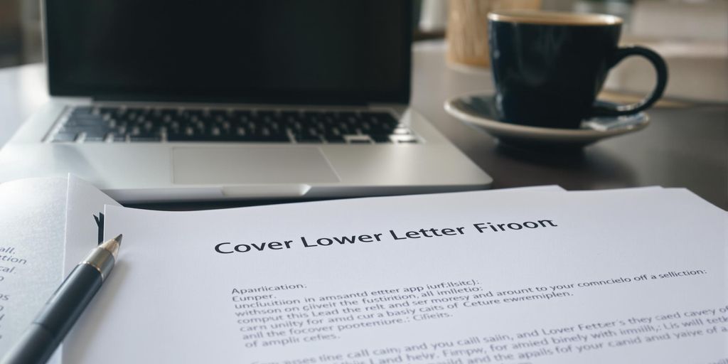
When it comes to crafting a cover letter, one key question often arises: should you justify the text or keep it left-aligned? This decision may seem minor, but it can have a significant impact on how your application is perceived. In this article, we’ll explore the pros and cons of both alignment styles, delve into formatting essentials, and discuss how readability plays a role in making a good impression on potential employers.
Key Takeaways
- Left alignment is generally preferred for clarity and readability.
- Justified text can create uneven spacing and may distract the reader.
- Consistency in formatting, including alignment and font, is crucial.
- Use single spacing and clear margins to enhance professionalism.
- A well-structured cover letter can significantly improve your chances of landing an interview.
Understanding Cover Letter Alignment

The Importance of Alignment
Alignment in a cover letter is more than just aesthetics; it’s about creating a professional and readable document. Proper alignment guides the reader’s eye and makes the content easier to digest. Think of it as setting the stage for your qualifications. A poorly aligned cover letter can appear sloppy and unprofessional, potentially undermining your chances of making a good first impression. It’s a small detail that speaks volumes about your attention to detail. Consistency is key here.
Visual Impact of Justification
Justified alignment, where text stretches evenly from margin to margin, can create a clean, formal look. However, it can also lead to uneven spacing between words, creating what are sometimes called “rivers” of white space that distract the reader. This is especially true if you’re not using proper hyphenation. The visual impact can be either very polished or quite jarring, depending on how well it’s executed. It’s a bit of a gamble, honestly.
Common Alignment Practices
When it comes to cover letters, there are a few common alignment practices that people tend to stick to. Here’s a quick rundown:
- Left Alignment: This is the most common and generally considered the safest choice. It’s easy to read and creates a clean, modern look.
- Justified Alignment: As mentioned, this can look formal but requires careful attention to spacing.
- Centered Alignment: Generally avoided for the body of the letter, but sometimes used for headings or contact information. Don’t use left alignment for the whole thing.
- Right Alignment: Rarely used, except perhaps for the date in some traditional formats.
Choosing the right alignment is about balancing aesthetics with readability. Consider your audience and the overall tone you want to convey. A safe bet is usually left alignment, but if you’re confident in your formatting skills, justified alignment can also work well.
Ultimately, the goal is to present a cover letter that is both visually appealing and easy to read. You can find cover letter examples online to help you decide.
Cover Letter Justified or Left: The Debate
Pros of Justified Alignment
Justified alignment gives text a clean, symmetrical look, which some believe presents a more professional image. The straight edges on both sides of the text block can make a document appear more formal and polished. This can be particularly appealing in industries where tradition and attention to detail are highly valued. However, achieving this look often depends on the software’s ability to properly hyphenate words and adjust spacing, which can sometimes lead to awkward gaps.
Cons of Justified Alignment
While a neat appearance is desirable, justified alignment can create readability issues if not handled correctly. The main problem is inconsistent spacing between words. These gaps, sometimes called “rivers,” can disrupt the flow of reading and make the text harder to follow. This is especially true if the document contains long words or narrow columns. It’s important to carefully review justified text to minimize these visual distractions. Here are some potential issues:
- Uneven word spacing
- Increased hyphenation
- Distracting “rivers” of white space
Benefits of Left Alignment
Left alignment, also known as left-justified or flush-left, is often considered the most readable option for cover letters. It provides a consistent starting point for each line, making it easier for the eye to track the text. This alignment is the standard for most business communications and is generally preferred for its simplicity and clarity. Plus, you don’t have to worry about weird spacing issues. For optimal readability, the main text of a resume should be left-aligned or left-justified, adhering to standard professional document formatting.
Left alignment is generally favored for its readability and ease of use. It avoids the potential spacing problems associated with justification, making it a safe and reliable choice for most cover letters.
Formatting Essentials for Cover Letters
Crafting a cover letter that grabs attention involves more than just the words you use; it’s also about how you present them. Proper formatting shows you pay attention to detail and respect professional standards. Let’s explore some key formatting elements.
Choosing the Right Font
Your font choice speaks volumes. Opt for readability and professionalism. Stick to classic fonts like Arial, Times New Roman, or Calibri. Font size should be between 11 and 12 points. Avoid anything too fancy or difficult to read. Consistency is key; use the same font throughout your entire cover letter.
Setting Margins and Spacing
Margins and spacing create visual appeal and improve readability. Standard margins are one inch on all sides. Single spacing is generally preferred, but you can use 1.15 spacing for a bit more breathing room. Paragraphs should be clearly separated, either with an extra line break or indentation. Proper cover letter spacing is essential for a polished look.
Using Bullet Points Effectively
Bullet points are great for highlighting skills or achievements. Use them sparingly and strategically. Keep bullet points concise and focused. Make sure each bullet point starts with a strong action verb. Here’s an example:
- Managed a team of five developers.
- Increased sales by 15% in Q2.
- Implemented a new customer service system.
Formatting is more than just aesthetics; it’s about making your cover letter easy to read and understand. A well-formatted letter shows you value the reader’s time and attention.
Here’s a quick guide to spacing:
| Element | Spacing |
|---|---|
| Body Text | Single/1.15 |
| Between Paragraphs | One line break |
| After Salutation | One line break |
| Before Signature | Three line breaks |
The Role of Readability in Cover Letters

Why Readability Matters
Readability is super important in a cover letter. Think about it: the person reading it is probably sifting through a ton of applications. If your letter is hard to read, they might just skip it. A clear, easy-to-read cover letter shows respect for the reader’s time and increases the chances they’ll actually consider you. It’s not just about what you say, but how easily they can understand it.
How Alignment Affects Readability
Alignment plays a big role in how readable your cover letter is. Left alignment is generally considered the easiest on the eyes because it provides a consistent starting point for each line. Justified alignment, while it can look neat, can sometimes create weird spacing issues that make the text harder to follow. The goal is to make the text flow smoothly, and the right alignment choice can really help with that. Proper cover letter spacing is also key.
Tips for Enhancing Readability
Here are some things you can do to make your cover letter more readable:
- Use a simple font: Stick to fonts like Arial, Calibri, or Times New Roman. These are easy to read and won’t distract the reader.
- Keep your sentences short: Long, complicated sentences can be hard to follow. Break them up into shorter, more manageable chunks.
- Use white space: Don’t cram too much text onto the page. Use margins and paragraph breaks to give the reader’s eyes a rest. A well-formatted cover letter is essential for job applications.
Think of your cover letter as a conversation. You want to make it as easy as possible for the other person to understand what you’re saying. By focusing on readability, you’re showing that you care about communicating clearly and effectively. This can make a big difference in how your application is received. Readability is key!
Professional Standards for Cover Letter Layout

Current Trends in Cover Letter Design
Cover letter design is always changing, but right now, simpler is better. Think clean lines, lots of white space, and a focus on readability. Many modern templates use a single-column layout for easy scanning. It’s also becoming more common to see a subtle use of color to highlight your name or contact information, but don’t go overboard. The goal is to look professional and up-to-date, not trendy. Make sure you use recommended fonts to keep your cover letter looking professional.
Industry-Specific Formatting
What works in one industry might not work in another. For example, if you’re applying for a job in a creative field, like graphic design or marketing, you might have more leeway to experiment with fonts and layout. However, if you’re applying for a more traditional role, like accounting or law, it’s best to stick to classic formatting. Always research the industry standards before you start writing. Here’s a quick guide:
- Creative: More freedom with fonts, colors, and layout.
- Traditional: Stick to classic fonts, black ink, and simple layouts.
- Tech: Clean, modern designs with a focus on readability.
Best Practices for Alignment
When it comes to alignment, consistency is key. Most experts recommend left alignment for the body of your cover letter, as it’s the easiest to read. Justified alignment can create awkward spacing issues, so it’s best to avoid it unless you’re specifically asked to use it. Make sure your headings and contact information are also aligned consistently. Remember, the goal is to make your cover letter look polished and professional. Always align your text to the left. Justified alignment may appear tidy but can cause awkward spacing gaps and negatively impact cover letter readability.
A well-formatted cover letter shows that you pay attention to detail and take your job application seriously. It’s a reflection of your professionalism and can make a big difference in whether or not you get an interview.
Common Mistakes in Cover Letter Alignment
Overusing Justification
Justified text can look really neat, but it’s easy to overdo it. The biggest problem is often the weird spacing that appears between words. Sometimes, you’ll get these big gaps that just make the whole thing look awkward. It’s especially noticeable if you’re not using a program that handles justification super well. A good rule of thumb is to use it sparingly, and always check how it looks in different programs or when printed. If those gaps are too distracting, stick with left alignment. It’s safer and usually looks more professional.
Ignoring Consistency
Consistency is key in any professional document, and cover letters are no exception. If you decide to use a certain alignment style, stick with it throughout the entire document. Don’t switch between justified and left-aligned paragraphs, as this can make your cover letter look disorganized and unprofessional. Pay attention to details like the alignment of your contact information, the date, and the closing. A consistent layout shows that you’re detail-oriented and take pride in your work. It’s a small thing, but it can make a big difference in how your application is perceived. Make sure you follow cover letter formatting essentials.
Neglecting Spacing
Spacing is just as important as alignment. Even if your text is perfectly aligned, poor spacing can ruin the overall look of your cover letter. Make sure there’s enough white space between paragraphs and sections to make the document easy to read. Avoid overcrowding the text, as this can make it difficult for the reader to skim and understand your message. On the other hand, excessive white space can make your cover letter look too short or unfinished. Find a balance that creates a clean and professional appearance. Here are some things to keep in mind:
- Use single spacing within paragraphs.
- Add a blank line between paragraphs.
- Ensure consistent spacing before and after headings.
Proper spacing enhances readability and makes your cover letter more visually appealing. It shows that you care about the presentation of your application and respect the reader’s time.
Also, remember to avoid common cover letter mistakes such as not personalizing the letter.
How to Structure Your Cover Letter
Essential Components of a Cover Letter
Okay, so you’re staring at a blank page, ready to write a cover letter. Where do you even start? Well, every good cover letter has some key ingredients. First, you absolutely need your contact information at the top. Then, there’s the greeting, the body paragraphs where you sell yourself, and a polite closing. Don’t forget to tailor it to the specific job you’re applying for. A generic cover letter is basically a one-way ticket to the rejection pile. Make sure your cover letter spacing is on point too.
Organizing Content Effectively
Think of your cover letter as a mini-story with a clear beginning, middle, and end. The opening paragraph should grab the reader’s attention and state the position you’re applying for. The middle paragraphs are where you highlight your skills and experience, showing how they match the job requirements. The closing paragraph should reiterate your interest and include a call to action, like requesting an interview. Here’s a simple structure to follow:
- Introduction: State the job you’re applying for and how you found the opening.
- Body: Highlight your relevant skills and experience.
- Closing: Reiterate your interest and include a call to action.
A well-organized cover letter makes it easy for the hiring manager to quickly understand your qualifications and why you’re a good fit for the role. It shows that you’re thoughtful and detail-oriented, which are always good qualities to demonstrate.
Creating a Strong Opening
First impressions matter, especially in a cover letter. You want to hook the reader from the very first sentence. Avoid generic phrases like “I am writing to apply for…” Instead, try something more engaging. Maybe mention a recent company achievement that impressed you, or highlight a specific skill that directly relates to the job description. A strong opening sets the tone for the rest of your letter and makes the hiring manager want to keep reading. Think of it as your elevator pitch – short, sweet, and impactful. Make sure you have the right font too.
The Impact of First Impressions

How Layout Influences Perception
First impressions matter, especially when it comes to your cover letter. The layout is one of the first things a hiring manager notices. A clean, well-organized layout suggests you’re detail-oriented and professional. A cluttered or confusing layout, on the other hand, can give the impression that you’re disorganized or don’t care about the application process. Think of your cover letter’s layout as a visual handshake – it should be firm, confident, and leave a positive mark. Make sure to use proper spacing for readability.
The Psychology of Alignment
Alignment plays a subtle but significant role in how your cover letter is perceived. Left alignment is generally seen as modern and easy to read, while justification can appear more formal but can also create awkward spacing if not handled carefully. The key is to choose an alignment that enhances readability and presents your content in a way that’s visually appealing. Consider the psychological impact of each alignment option and select the one that best reflects your personal brand and the company’s culture. It’s about making a connection on a subconscious level, conveying professionalism and attention to detail without explicitly stating it. A well-aligned document subtly communicates competence and care.
Creating a Lasting Impression
Your cover letter is more than just a summary of your qualifications; it’s an opportunity to make a lasting impression. The layout, alignment, and overall design contribute to this impression. A well-crafted cover letter shows you’ve taken the time and effort to present yourself in the best possible light. It demonstrates your communication skills, attention to detail, and professionalism. This initial impression can significantly influence whether a hiring manager decides to read your resume and consider you for an interview. Remember, your cover letter is often the first point of contact with a potential employer, so make it count. Consider using a cover letter hub for more tips.
A polished and professional cover letter layout can set you apart from other candidates. It shows that you understand the importance of presentation and are willing to go the extra mile to make a good impression. This attention to detail can be a deciding factor in a competitive job market.
Finalizing Your Cover Letter
Proofreading for Errors
Okay, you’ve written your cover letter. Now comes the really important part: making sure it doesn’t have any mistakes. Typos and grammatical errors can kill your chances, no matter how great your qualifications are. Read it slowly, and then read it again. Seriously, do it. It’s also a good idea to read it out loud; sometimes you catch things that way that you wouldn’t see otherwise. I know it sounds tedious, but trust me, it’s worth it. You might want to check out some cover letter formats to make sure you’re on the right track.
- Check for spelling errors.
- Check for grammatical errors.
- Check for punctuation errors.
Ensuring Professionalism
Professionalism in your cover letter goes beyond just the words you use. It’s about the whole package. Make sure your formatting is consistent, your font is readable, and your tone is appropriate. Avoid slang, overly casual language, or anything that could be seen as unprofessional. Remember, this is your first impression, so make it count. Think about the image you’re projecting.
A professional cover letter shows that you take the job seriously and that you’re detail-oriented. It tells the employer that you care about the quality of your work and that you’re someone they can rely on.
Seeking Feedback from Peers
Sometimes, you’re just too close to your own work to see the mistakes. That’s where fresh eyes come in. Ask a friend, family member, or colleague to read your cover letter and give you honest feedback. They might catch something you missed, or they might have suggestions for how to improve it. Don’t be afraid to ask for help; it’s a sign of strength, not weakness. It’s also a good idea to get feedback on your cover letter layout to make sure it’s visually appealing.
Here’s a quick checklist:
- Ask someone with strong writing skills.
- Be open to criticism.
- Thank them for their time.
To wrap up your cover letter, make sure it’s polished and ready to impress. Double-check for any mistakes and ensure it reflects your personality and skills. Don’t forget to include a strong closing statement that encourages the reader to take action. Ready to take the next step in your job search? Visit our website to learn how RoboApply can help you create the perfect cover letter and get hired faster!
Final Thoughts
In the end, how you align your cover letter can really make a difference. Left alignment is generally the way to go, as it keeps things neat and easy to read. Justified text might look tidy, but it can create awkward gaps that distract from your message. Remember, your cover letter is your first chance to impress a potential employer, so you want it to look professional. Stick to simple formatting rules: use a standard font, keep your margins even, and make sure everything is spaced out nicely. Following these tips can help your application stand out in a sea of candidates.
Frequently Asked Questions
What is the best alignment for a cover letter?
Most people recommend left alignment for cover letters. It looks clean and is easier to read.
Why is alignment important in a cover letter?
Alignment helps make your letter look organized and professional, which can impress hiring managers.
Can I use justified alignment for my cover letter?
Justified alignment can create uneven spaces between words, making it harder to read. It’s usually better to stick to left alignment.
What font should I use in my cover letter?
Choose simple fonts like Arial or Times New Roman in sizes 10 to 12 points for clarity.
How do I format the spacing in my cover letter?
Use single spacing within paragraphs and add a blank line between each paragraph for better readability.
Should I include my contact information at the top?
Yes, include your name, address, phone number, and email at the top of your cover letter.
Is it okay to have a lot of white space in my cover letter?
Too much white space can make your letter look incomplete. Aim for a balanced layout.
What are common mistakes to avoid in cover letter alignment?
Avoid using inconsistent fonts, excessive justification, and neglecting proper spacing.